Click covers for info. Copyright (C) Rudy Rucker 2021.


Author Archive

Hype and Anti-Hype

Monday, June 4th, 2012

Hype and Anti-Hype

I’ve been lost in a fog of hype for months now—what with promoting my Nested Scrolls autobio this winter, putting out Flurb #13 and converting it into an ebook, and recently spending all my time getting my Transreal Books line going.

Not to mention tweeting and blogging. And layering on link tags all over the place.


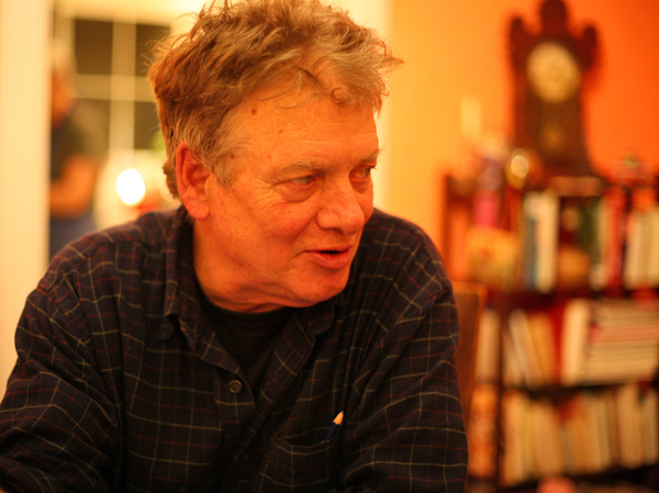
[Terry Bisson]

I even put out some hype for someone other than myself this week, a book review of Terry Bisson’s great alternate history memoir, Any Day Now. The review is in this interesting new online literary journal, the Los Angeles Review of Books—meant to be a kind of left-coast mirror of the august New York Review of Books.

On the subject of hype, I’ve heard media figures say that they get into trouble when they start believing their own hype. I mean I’ve heard rappers say that, anyway. What is the nature of the danger, exactly?

Maybe, if I believe the hype, I don’t feel a need to even try to write, as I think I’m already so great. Maybe, if I believe my hype, then I’m not willing to put in the work it takes to write because I’m too “important” for the thousand-miles-on-foot slog of writing a novel.

Or maybe, if I believe the hype, I do still want to write, but I become blocked—because nothing I actually do write lives up to the hype? That is, maybe if I believe the hype, when I try and get to work, I freak out over the very real disparity between the contingent and mortal quality of what I actually do write vis-a-vis the much higher quality that my hype ascribes to my oeuvre.

Or, yet again, maybe I am still able to write but, believing the hype, I get lazy and begin neglecting the necessary but painful work of outlining, revision, scientific theorizing, and pre-visualization—this happens to older writers sometimes.

Or perhaps, if I believe my hype, I lose my sense of humor and become pompous and self-referential. “Fatuous,” to use an apt word that I’ve heard Bruce Sterling use (when arguing with me about some revisions to one of our many collaborative short stories). Fatuosity is another danger for established writers.


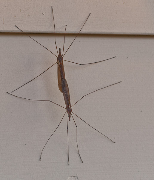
[Two mayflies in conjugation]

I’m hoping soon to get away from the hype and back to my actual work. Giving the finger to consensus reality. Turning my back on received ideas—even if they come from me.

As I’ve already kvetched in these posts, one thing that’s holding me back from writing at this point is that I don’t feel like working on my new novel, The Big Aha , until I find a path for publishing my last one, Turing & Burroughs. If I don’t get something set up by the end of June, I’ll probably publish Turing & Burroughs via my own line of Transreal Books, just to get it off my back. It’ll be a bit of a blow to my self-esteem to join the ranks of the self-published novelists. But that seems to be the way the wind’s blowing. I heard the other day that the august house of Houghton-Mifflin is bankrupt. Leaving more and more writers scrabbling in the gutter with the literary lepers…

Bringing us to the theme of anti-hype. Somewhere (although I can’t find the exact location) Thomas Pynchon writes that a certain kind of seeker (mystic, writer, or artist) needs an “unwiltable hard-on” of ambition. (Let’s suppose this can apply to female seekers as well, the “hard-on” being, after all, metaphorical—a psychic dildo, if you will.)

In a similar vein, there’s a saying attributed to Rabbi Hillel, “If I am not for myself, who will be?” (Hillel complicates matters by adding on, “If I am only for myself, what am I? And if not now, when?”)

To some extent, I like to think that, if nobody hates what I’m doing, then I’m not going far enough. But if everybody hates what I’m doing—gosh, maybe I’m on a wrong path. But so far, there’s always been a few loyal friends or fans who approve of what I’m doing. So I continue on, largely unchanged.

And there’s always the bitter SubGenius motto: “F*ck them if they can’t take a joke.”

What about the strategy of trying to bend your work to be a better fit for the market? That tends not to work. You get into playing catch-up ball, to use *ack* a sports metaphor, and your style suffers. Or your style stays the same, but nobody believes your claim that you’ve written a steampunk or urban fantasy or whatever kind of book.

I once heard someone ask William Burroughs why he didn’t “just” write a bestseller to make some money. The old master said that something like the following:

“It’s not possible. People may think they can sit down and write a bestseller, but you can’t do it. A bestseller is written up to the level of a man’s ability. You can’t write down to the reading public.”


[Rudy at the Met]

Whatever else it is, writing is pleasant, addictive, and a path to self-knowledge. It’s just nice to have an excuse for doing it. I always seem to find some kind of project to work on, even if it’s not a novel. So what am I writing these days? Well, I’m polishing up my Journals, 1990-2012, getting them into a format that I can publish via, ta-da, Transreal Books. Ebook and paperback, probably.

So for now I’m puttering around, getting those the half million or so words wrestled into a reasonable shape. It’s passing the time in any case.

Comparing Writing and Painting

Thursday, May 31st, 2012

Today I’m discussing some analogies between writing and the visual arts (drawing and painting). By way of background, here are links to a bunch of my drawings (for Saucer Wisdom) and to my paintings.

(i) When drawing, I get some quick sketch in pencil, then ink it in, then have to white out pieces and redraw them. Or if I’m painting, the same thing, I just rough it out in light paint and see if it’s the right shape. I don’t actually have the ability to draw a person so they look exactly right on the first go. When painting I pick away at it with my brushes and colors until it looks okay.

In writing I try and write a rough version of the section pretty quickly, then go over it and tune it, and then there will be things that don’t work that I have to keep redoing. But eventually I feel it’s right. Versimilitude is a process, not a one-shot thing. And (side-point) photo-realism isn’t the only goal.


[A likeable punk roadie for The Recently Deceased, seen at the Anarchist Book Fair in Golden Gate Park.]

(ii) In drawing, whenever there’s a part I’m confused about—something tricky like two hands holding each other—I end up having to use lots and lots of white-out. Or if I’m painting I rub off paint and layer new paint over. And it ends up all bumpy and crufty and never does look as smooth and clean as the rest of the picture.

In writing, the transitions or actions I’m not clear about take the most rewriting and reworking. But I don’t think it’s necessarily true that a rewritten patch has to be bumpy and crufty as does a redrawn patch; in drawing the bumpiness is partly a result simply of the not-so-great physical properties of the white-out, or in painting it has to do with whether or not I bother to sand off the bumpy impasto layers beneath. But maybe gnarly cruft is okay too.


[Street murals in Balmy Alley off 24th St. in SF.]

(iii) When drawing or painting, I sometimes think that if only I could take the time to fully visualize the difficult passage then I’d be able to draw it clean and right the first time. But often it just seems too hard to think, and I go ahead and draw it or paint it wrong, just so I have something to work off of.

In writing, I’ll often think that if only I could fully think through a scene I could write it much more effectively. But many times it’s just too hard to think all that—I’ll feel like being active, in touch with the medium, so I just go ahead and write even though I’m not sure what I’m doing. And then I take it from there.

(iv) In both mediums, I need to realize that something that might have the superficial appearance of a finished piece, but that it’s really still a sketch or a first layer that needs to be reworked. I’m kind of surprised how prolonged a process it is to make a drawing or what I consider to be a finished painting. I hadn’t realized it would take so much revision. By long experience, I’m of course familiar with the huge amount of revision that a written scene takes. It’s kind of comforting to see that visual art can be just as hard.


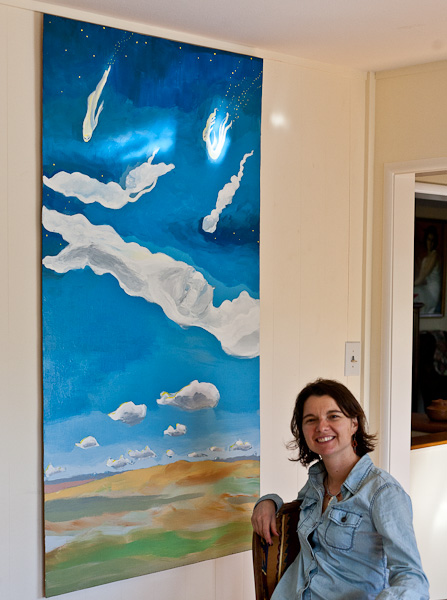
[Clouds’ Point of View , painting by Isabel Rucker.]

(v) My old art mentor Paul Mavrides says about art in general, “It’s not the realistic style that matters so much. It’s having something to say.” And this makes me feel free to write a little more cartoony and sketchy sometimes. Or to be more expressionistic in a painting. And in writing this idea helps me fight my feeling of being inferior to a fine literature exponent who creates beautifully textured descriptions and aperçus in a work that perhaps doesn’t have all that much to say.


[Copa Loca ice-cream parlor in the Mission.]

(vi) I worship the notion of “eyeball kicks,” as in the early cartoons by Will Elder in Mad and Panic. Elder’s eyeball kicks are, to me, of a piece with the piled-on detail of Bosch’s teeming works. A higher apotheosis is reached in the later Bruegel where there’s still very much action, but the surface doesn’t teem and wriggle, it’s harmonious and integrated. And this I try and fill up the surfaces of my canvases.

And Will Elder, Bosch and Bruegel have always been touchstone icons for the kinds of novels I want to write. Over the years I’ve felt like my writing has gotten closer to this ideal. It’s a matter of taking your time…without losing the thread.


[View of SF from McLaren Park, reminds me of the crystal city in the background of a Bosch painting of Saint Anthony (not the triptych one).]

(vii) One problem in painting or in writing is how to suggest the endless levels of Nature’s span and detail while only using a square meter of canvas or a hundred thousand words. Painting and drawing use the trick of perspective at the high end. At the low end, a painter can use the fact that the fractal structure of paint is like the fractal structure of plants and dirt.

Writing uses the trick of narrative at the high end—suggesting a universal theme. At the low end, writing uses the telling detail, especially the cunningly selected and seemingly random detail. At first it doesn’t look like writing owns a shortcut fractal trick like paint-scumbling. But the fractal, multiply-linked nature of language is the Muse’s gift to writers. I’m thinking about the way that a word can mean so much more than it ought to. Just those few little letters hook into so many associations. A well-chosen phrase manages, like a skillful glob of paint, to signify more than itself.

My Complete Stories in Paperback

Tuesday, May 29th, 2012

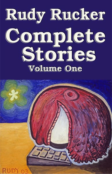
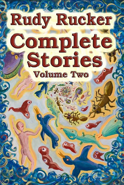
A trove of gnarl and wonder! Complete Stories is now available in paperback from Transreal Books. Two volumes, over 500 pages each. (Note that the combined contents of both volumes are still available as a single two-in-one ebook on Transreal Books.)

$16.00 each.

Volume One, 1976-1995 ranges from the cyberpunk to the transreal, including collaborations with Paul Di Filippo, Bruce Sterling and Marc Laidlaw.

Volume Two, 1996-2011 includes fifteen tales previously uncollected in any paper edition. Features collaborations with Bruce Sterling, Marc Laidlaw, Paul Di Filippo, John Shirley, Terry Bisson, and Eileen Gunn.

And, once again, you can check the Transreal Books page for the combined two-volumes-in-one ebook option.

Today’s two-volume paper edition is for those who enjoy tangible books. As I mentioned in my previous post, I laid out the text with InDesign, and the books look pretty good.

(And, yes, I still expect that William J. Craddock’s Be Not Content will be out in paperback soon, assuming I can straighten out some final details.)

“Garden of Eden,” Mark Pauline, InDesign

Monday, May 28th, 2012

I finished a new painting today, Garden of Eden.


“Garden of Eden,” oil on canvas, May, 2012, 40” x 30”. Click for a larger version of the image.

I started this picture over six weeks ago, on April 9, 2012. My usual partner in crime, Vernon Head, went out for an en plein air painting session with me on the bank of a stream that runs into the south end of Lexington Reservoir . It was a pretty spring day, and we daubed away. The one thing that caught my attention the most was a particular bend in the trunk of a tree overhanging the creek.

So that made it into my painting, but not all that much else about the actual scene. As I’ve mentioned before, Vernon (see his lovely and realistic paintings) always kids me, “Why do you even go look at anything outside, when you’re just going to end up painting a dinosaur and a UFO?”

Well, it’s fun. I worked on this painting much longer than usual—but there’s no rush. Now I just have to start another one. It’s soothing to be out in my back yard smearing around the colors. So non-digital.

Speaking of artists, I saw the legendary SRL artist, Mark Pauline last week, demonstrating his latest creation in a parking lot outside the funky Tenderloin Phoenix Hotel, where an art show was taking place. (That’s not the Phoenix in the background, that’s the Federal Building with the IRS and the FBI, cowed (one hopes) by Mark’s claw.)

A few of the old hipster faithful were there: Karen Marcelo, V. Vale, and the artist Kal Spelletich. (Karen and Vale shown above.) Mark spoke on a panel before the demo, and talked about “quasi-criminal art”—an inspiring phrase. Then we went outside and Mark did a demo of his new “Spine Robot,” accompanied by his young son, who was eager to play with the controls as well. Here’s a photo of them.

Otherwise I’ve been busy getting my Transreal Books into POD (print on demand) paperback editions as well as in ebook format. I’m almost there. I decided that a Word file doesn’t really look nice enough to be sold as a print book, so I took a big jump and began using Adobe InDesign typographer design ware.

I found InDesign to be the hardest program I’ve had to learn since tackling the Microsoft C++ debugger about fifteen years ago. A learning curve like the face of Half Dome. And the official documentation, as is so often the case, is rather cryptic or even, to put it bluntly, sucks. Googling my questions helped a little.

My basic problem with InDesign—which I still haven’t resolved—is that I don’t have a mental model of the logical space that the program is “thinking” in. It makes a distinction between the “pages” (like of your book) and the “text” (which is what you’re putting on the pages) and to spice things up it has “threads” (which connect some, but not all, of the pages to each other) and “spreads” of, ideally two facing pages (but when you add pages, the new pages sometimes end up being a toilet-paper roll of right-hand pages all stuck together). Here’s the Adobe help page that “explains” it. I’ve read this page, like, fifteen times, and still no joy. The catch, I’ve been learning, is that some of the statements made on this page seem to be untrue or in some way misleading, and if I act on these particular statements, I freeze up my machine.

Never mind. I’m working around the dodgy bits. And with experience the mysteries will slowly clear away like morning mist in the summer sun.

The bottom line, in any case, is the InDesign does really beautiful text layout with clean justification (straight right margin) achieved by varying the spaces between the words, the spaces between the letters (kerning), and even (if you like) a two-percent variation in the actual sizes of the letters. So when you’re done—shaking with fatigue, desperate with confusion, your eyes glazed from scanning obscure screens and Googled-up help pages, your back a knot of pain—when you’re done, the layout looks really slick.

I’ve laid out three books now, and I trust that, as I move forward, it’s gonna be easier.

Sylvia and I took an afternoon off to walk in a park near us where a lot of Canada geese live. Five goslings!


Rudy's Blog is powered by WordPress