


I finished a new painting today, Garden of Eden.
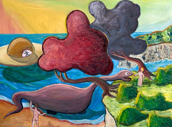
“Garden of Eden,” oil on canvas, May, 2012, 40” x 30”. Click for a larger version of the image.
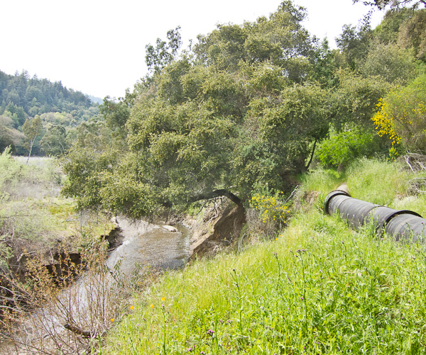
I started this picture over six weeks ago, on April 9, 2012. My usual partner in crime, Vernon Head, went out for an en plein air painting session with me on the bank of a stream that runs into the south end of Lexington Reservoir . It was a pretty spring day, and we daubed away. The one thing that caught my attention the most was a particular bend in the trunk of a tree overhanging the creek.
So that made it into my painting, but not all that much else about the actual scene. As I’ve mentioned before, Vernon (see his lovely and realistic paintings) always kids me, “Why do you even go look at anything outside, when you’re just going to end up painting a dinosaur and a UFO?”
Well, it’s fun. I worked on this painting much longer than usual—but there’s no rush. Now I just have to start another one. It’s soothing to be out in my back yard smearing around the colors. So non-digital.
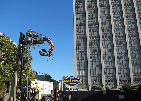
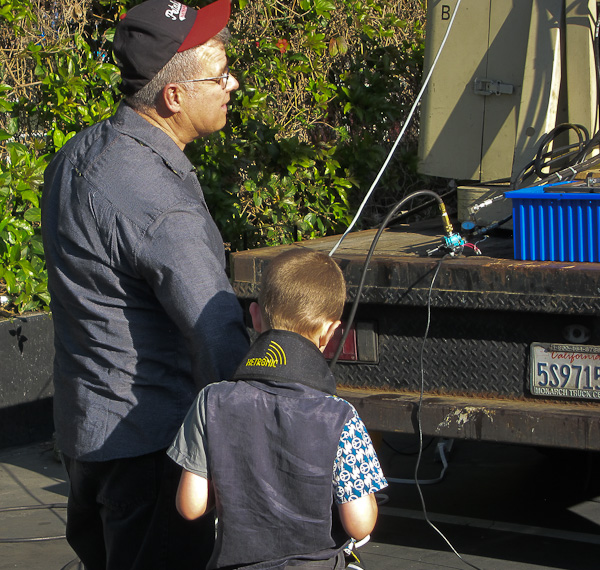
Speaking of artists, I saw the legendary SRL artist, Mark Pauline last week, demonstrating his latest creation in a parking lot outside the funky Tenderloin Phoenix Hotel, where an art show was taking place. (That’s not the Phoenix in the background, that’s the Federal Building with the IRS and the FBI, cowed (one hopes) by Mark’s claw.)

A few of the old hipster faithful were there: Karen Marcelo, V. Vale, and the artist Kal Spelletich. (Karen and Vale shown above.) Mark spoke on a panel before the demo, and talked about “quasi-criminal art”—an inspiring phrase. Then we went outside and Mark did a demo of his new “Spine Robot,” accompanied by his young son, who was eager to play with the controls as well. Here’s a photo of them.
Otherwise I’ve been busy getting my Transreal Books into POD (print on demand) paperback editions as well as in ebook format. I’m almost there. I decided that a Word file doesn’t really look nice enough to be sold as a print book, so I took a big jump and began using Adobe InDesign typographer design ware.
I found InDesign to be the hardest program I’ve had to learn since tackling the Microsoft C++ debugger about fifteen years ago. A learning curve like the face of Half Dome. And the official documentation, as is so often the case, is rather cryptic or even, to put it bluntly, sucks. Googling my questions helped a little.
My basic problem with InDesign—which I still haven’t resolved—is that I don’t have a mental model of the logical space that the program is “thinking” in. It makes a distinction between the “pages” (like of your book) and the “text” (which is what you’re putting on the pages) and to spice things up it has “threads” (which connect some, but not all, of the pages to each other) and “spreads” of, ideally two facing pages (but when you add pages, the new pages sometimes end up being a toilet-paper roll of right-hand pages all stuck together). Here’s the Adobe help page that “explains” it. I’ve read this page, like, fifteen times, and still no joy. The catch, I’ve been learning, is that some of the statements made on this page seem to be untrue or in some way misleading, and if I act on these particular statements, I freeze up my machine.
Never mind. I’m working around the dodgy bits. And with experience the mysteries will slowly clear away like morning mist in the summer sun.
The bottom line, in any case, is the InDesign does really beautiful text layout with clean justification (straight right margin) achieved by varying the spaces between the words, the spaces between the letters (kerning), and even (if you like) a two-percent variation in the actual sizes of the letters. So when you’re done—shaking with fatigue, desperate with confusion, your eyes glazed from scanning obscure screens and Googled-up help pages, your back a knot of pain—when you’re done, the layout looks really slick.
I’ve laid out three books now, and I trust that, as I move forward, it’s gonna be easier.
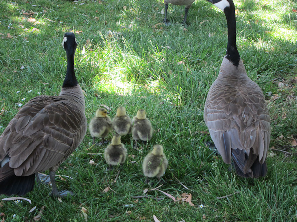
Sylvia and I took an afternoon off to walk in a park near us where a lot of Canada geese live. Five goslings!
May 31st, 2012 at 8:56 am
Hey Rudy-Any chance of Flurb paperbacks coming out?
May 31st, 2012 at 11:13 am
Flurb paperbacks? Maybe…we’ll see. It’s definitely something I’m thinking about, but I have a few projects ahead of it on the queue.
June 9th, 2012 at 3:41 pm
Hey, I just wanted to let you know how much I truly miss just being able to walk into, say a “University Bookstore” and find all of your eclectic (and absolutely mesmerizing) content RIGHT THERE ALREADY IN PRINT TO PURCHASE.
I don’t buy “e-books”. I really love the physical aspect of both owning, reading, and storing (for future use) of a physical personal collection (i.e. Library) of REAL BOOKS. I am very glad that at least you have chosen a “new” method that does involve actual PRINTING, yet I also long so deeply for “the good old days”.
What will some future archaeologist unearth in this mainly all-digital world that we now live in? Certainly not the Dead Sea Scrolls (much less ReSearch: William S. Burrows!!!)
Keep up the fight for the printed word please!
June 9th, 2012 at 3:45 pm
My comment was actually intended for V. Vale but from the looks of it, it probably also applies to you, Rudy. Good job.