


I’ve been working on my painting websites again; I have a local “Rudy’s Paintings” page on my site, and I’m now done with uploading higher-res better-color versions of my pictures to Imagekind, a company that sells prints of images online. My Imagekind address is simple: rudy.imagekind.com
It’s been a long, drawn-out process getting the pictures up. I first had the idea a few months ago when one of my fans emailed that he wanted to buy prints of my paintings. I did some research and found a couple of sites that sell prints of pictures. The artist sends in the image file, and the site takes the orders, makes the prints, collects the money, sends the prints out, and gives the artist a cut.
Zazzle.com is for the T-shirt and coffee-cup market. Art.com is the biggest image-seller, I think, but Imagekind has maybe a classier feel, and maybe they’re a bit more artist-friendly. So I opened my “free” rudy.imagekind.com account at Imagekind. (Sell it, Ru.)
Next was the issue of how to get good images of my pictures. I shot some images with my digital camera, but the resolution isn’t all that high. With my new 8 Meg SONY digital I get 3,200 by 2,400 pixels. Also my sense was that the image quality wasn’t going to be as good with the pocket point-and-shoot as it would be with my trusty old Leica, a clunky old R3 single-lens reflex that feels like it’s made of solid steel. Many people dis the R3 model, actually, as the body was made by Minolta, but the lenses are still that classic Leica glass.
Initially, I thought I’d get prints and scan those and thereby get hi-res images. Dumb idea. . If you scan a print, you add two weak points in the image chain: (a) you’re dependent on a desktop scanner, whose quality isn’t necessarily that great, and (b) you’re undergoing image degradation via the process of printing from negative to paper, and who knows how reliable the printing process is gonna be in any instance. So I decided to have the photo shop directly scan my negatives to CD (I only recently grasped that they can “invert” a negative’s scan so the colors are “normal” and it looks like a slide.) Unfortunately, the local shops only scan at 2000 ppi (pixels-per-inch), and a “35 mm” negative has the dimensions of about 1.5 inches by 1 inch, so you end up with 3100 by 2100 pixels, which is no better than what the digital camera does.
By the way, the shops can scan negatives or slides equally well, although if you’re heading towards scanning, slides are out to be a better way to go, as it’s easier to select out and send in individual slides for further scans than it is to send in strips of negatives a hope they scan the right ones. And it turns out you can get a wider range of high-end color-sensitive film in slide format.
One stressful thing is that, if the photo shop people don’t know what they’re doing, and if you don’t make a real pest out of yourself, they’ll often scan at some incredibly low resolution, like 400 ppi—I had Long’s Drugs do this to a roll of film last week, giving me images that were—ye gods—640 pixels across. Also, if you aren’t a pest, the drugstores will scan to a low or at best medium JPEG quality setting. But you can always get the negatives or slides re-scanned.
Shooting the pictures, I came to the question of lighting. I don’t have a flash for my Leica, and my sense is that flash produces somewhat uncontrollable glare in any case, and you can’t tell until you get the film developed. So I tried setting up lights; I actually went to the hardware and bought this heavy-duty rack of halogen lights. They were plenty bright, but there was huge glare problem unless I put the lights way over to the side and had them glance off the canvas at a shallow angle. But then, since I only had the one rack of lights, I had the problem that one side of the canvas would be lit more brightly than the other. Not good.
Regarding glare, I did find that the problem is less if you back off and use a longer lens, that is, go with a 90mm if you have it, or in any case a 50mm instead of your 35mm. The closer to the canvas you physically are, the likelier it is that you’ll be including a glare angle. But it’s hard to beat the glare unless you have lights on both sides, and, better, pro-lights with gauze screens over the bulbs.
After a few bad rolls of film, I gave up on lights and went out on my deck, where I get a nice bright low sun California coming in full in the mornings. I got the best slide film I could find, some expensive Ektachrome, relatively slow for finer grain and richer color: ASA 100. I put the canvases on a nearly vertical easel and I put the camera on a tripod, adjusting the camera so its height matched the center of the canvas. I used a plunger-type remote to press the shutter so I didn’t have to worry about jiggling the camera. I measured the distance with a tape-measure to confirm what the rangefinder was telling me. I stopped the camera down to something like f11 or f16 for crisp focus, and I shot each picture at three speeds, bracketing to make sure that at least one image would have a good exposure.
So then I got the resulting slides scanned at 2000 ppi (pixels per inch) at the local photo shop and picked out the good ones. But then I wanted to get a higher-res scan so that I could sell bigger prints of my pictures.
If you want to pay maybe $20 to $50 per picture you can get an individual negative or slide “drum scanned” at much higher density, like up to 10,000 ppi if you like. But there are a number of lower-end mail-order firms which will scan at 4,000 ppi, and that turns a slide into an image with dimensions of some 5,800 by 4,000 pixels. I went with one of these companies called Digital Memories in, I think, somebody’s home in Ohio, proud owners of high-end Nikon Coolpix scanner.
A plus in getting the 4,000 ppi mail-order scan was that the Digital Memories guys were willing to (a) save the images in the eidetic TIF format instead of the standard lossy JPG format that the local shops use, and to (b) scan at 48 bits of color information per pixel instead of the usual 24 bits per pixel. This makes for gigundo TIF files of nearly 100 Meg per image. But they put them all on a DVD, rather than a CD.
By the way, the important thing about TIF file is that you can keep re-opening it and re-editing the color maps and saving it, and you aren’t degrading the information in the image by doing this. With a JPEG image, every time you save it, you’re crushing a little more information out of it.
Even though my scans came back a little dark, I was able to fix the pictures to look nice in Photoshop CS1. I used the crop tool with Perspective turned on to crop the canvas to occupy the full picture frame. The crop tool lets you select a trapezoidal or arbitrary quadrilateral area, which means you get to correct for perspective distortion.

And then I worked on the colors and contrasts for days. Most often I used these three Image | Adjustments dialogs: Shadow / Highlight, Color Balance, and Hue / Saturation. One of the virtues of having the image in 48 bit color is that you’re less likely to be clipping graded colors into flat areas, as having more bits gives you a bigger range of possibility to play in, a bigger color-space room where you don’t smack into the walls.
At first I was trying to make the images look like me paintings, but after awhile I realized that’s flat-out totally and utterly hopeless. So then I just went for making the images look good, making them pop and be crisp, making them sweet and warm. Sometimes I’d even use the Magnetic Lasso tool to select a region and adjust its color separately.
To make the size of TIF smaller, I found that I could save them with either LZH or ZIP compression. The ZIP compression makes them the smallest—this is again without any actual loss of information. Once one of my 4,000 ppi 48-bit color images is cropped and put into ZIP it’s around 70 Meg.
Given that I have about 18 paintings, I now have net mage data that’s amount pushing two Gigs, far in excess of the 100 Meg that Imagekind gives you for a “free” account. So I bit the bullet and shelled out $100 for a year’s “Platinum” account on Imagekind, which gives me unlimited memory. In fact, since I have unlimited room now, maybe later I’ll upload some of my photographs in hi-res in case anyone wants to buy prints of those.
The Imagekind servers are sloooow. It took me the better part of two days yesterday to upload my two Gigs worth of files. I’ve blown a lot of time and money on this so far. Help me break even on this public service! Here comes Ed McMahon to tell you the URL again. What’s the frequency, Kenneth? “rudy.imagekind.com”
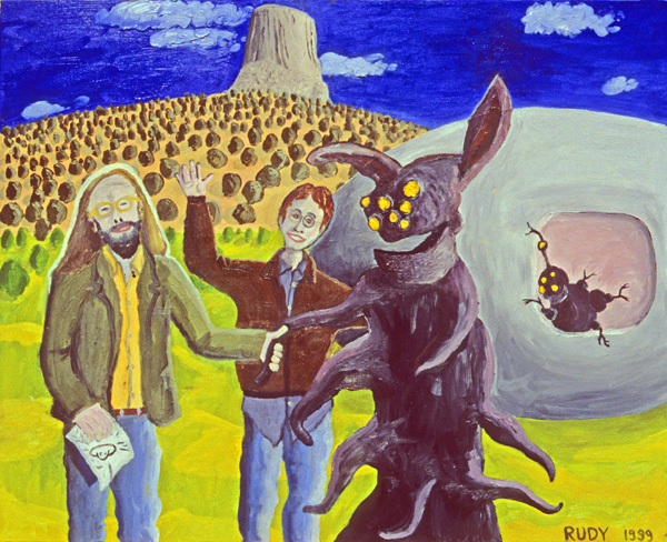
If you want some explanations regarding what the paintings are “about,” I wrote up a longish set of notes on the paintings that are incorporated into the Imagekind RSS feed from my gallery.
I’m hoping to do more painting this summer. And, oh yeah, I need to get back to work on that, um, psipunk postsingular hylozoic novel I’m writing.
May 5th, 2007 at 6:49 pm
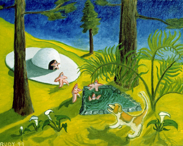
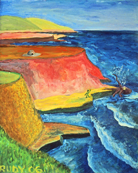
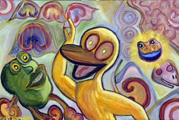
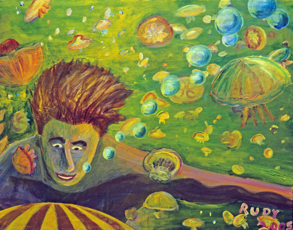
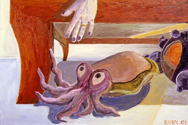
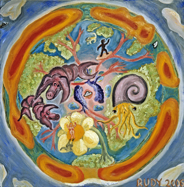
Rudy, Rudy, Rudy… The photography, the scanning, the manipulation :::::::sigh::::::: now you’ve grokked the meaning of struggling for one’s art — not to mention creating the art itself! All that’s missing are the heavy chains of unrelenting cynicism. Oh, but that’s not you, is it? I especially like the psychotic duck, the octopi, and the Easter Island head escaping by surfboard. Cheers!
May 5th, 2007 at 9:07 pm
I love your art. The colors cheer me up and make me feel warm and happy.
May 7th, 2007 at 4:49 am
Hi, I made this (actually my friend Otso at http://www.ozoneplayer.com layed out the structure, and I generalized its definitions), check out, deals with mind, physics and music). There is lot that correlates to quantum states and telephaty running there in the engine room. Very perplexing mental pultry philtre to view world like this one I come across, http://www.lightworker.com/WebofLove/Scientific.htm
Here: http://pekanart.com/sims2/6/11/monitor/feeds/
May 7th, 2007 at 6:07 am
I’ve loved your work since I saw it on the cover of an old Boing Boing mag. Your use of color and the rather unique way of seeing forms and shapes is an inspiration in this cookie-cutter world. Thanks for your vision and sense of play!
Kent
May 7th, 2007 at 10:44 am
Rudy, I think the critic-types would characterize you as an ‘outsider artist,’ but that’s probably what you were going for in the first place. Great stuff!
May 7th, 2007 at 4:36 pm
Nicw work, it seems familiar, Anne
May 9th, 2007 at 1:45 pm
Good stuff, rude boy. It is a nice, connected feeling to know a bit about where that stuff is coming from. Son Tony reconnected, you’re infecting the next generation. Perhaps already the one after that.
October 5th, 2007 at 3:42 pm
Thanks for news of your upcoming exhibit and congratulations on both the exhibit and the new novel.
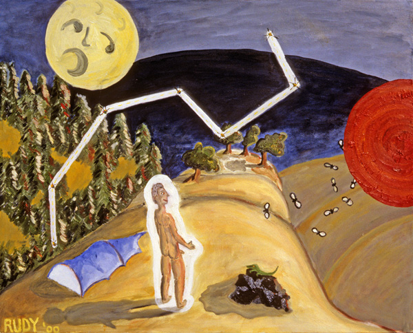
The circular image on this post (above) reminds me of a wonderful picture at the Met by Giovanni di Paolo (you have a kindred spirit in the Renaissance).
Here’s the link:
http://www.metmuseum.org/Works_of_Art/viewOnezoom.asp?dep=15&zoomFlag=0&viewmode=0&item=1975%2E1%2E31
Looks almost as though you and Giovanni are doing “before” and “after” of the same singularly significant moment of early history.
What do you think?! Best wishes.
July 26th, 2008 at 8:35 pm
I read similar article also named My Art at rudy.imagekind.com, and it was completely different. Personally, I agree with you more, because this article makes a little bit more sense for me
September 12th, 2008 at 2:38 am
Love your work. Perhaps you would like to publish a Google Theme? I think it would be awesome!
http://code.google.com/apis/themes/docs/dev_guide.html
Interactive art…
I’m working on a theme now using some of my photography.
Darryl
October 4th, 2008 at 5:23 pm
I love your painting. Your use of color is bright and happy. Of course the first thing that hits you is your imagery, playful and funny. I love the Easter Island figure, and the cephalopods. I also love the ‘painterly’ way you use your paint, rather impressionistic, showing all your brush strokes while still painting within the lines. I will look forward to seeing more.
December 26th, 2008 at 1:21 pm
Hey rudy, your work inspires me. i was looking for pieces online that might trigger something in my mind, but nothing seemed to work. i finally found ur pieces….. and i gto the inspiration needed to draw my own masterpiece. this is amazing! i love it all.
June 5th, 2012 at 5:31 pm
This will come in useful in helping me transfer my art prints to the computer. Thanks for sharing your process 🙂 I hope imagekind has been a great experience for you since you wrote this.
October 4th, 2012 at 6:31 am
WONDERFUL! I’m really inspired with your artworks, Rudy! KEEP IT UP!