


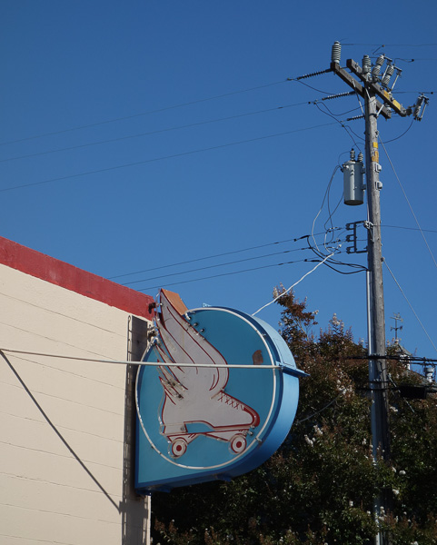
I’ve been working on my books as usual. Rolling right along. Photo of a Santa Cruz roller rink below.
I’m done with the copy-editing and proofreading for The Big Aha , and it’s in good shape. I went through some soul-searching about the serial comma, that is, which do I prefer” “Gray fur, yellow teeth and a naked pink tail.” or “Gray fur, yellow teeth, and a naked pink tail.”
In principle, I’d prefer always to use the serial comma, as then I don’t have to think about it. But maybe sometimes I leave it out without noticing. So I might use it and not use it in the same document. And copy-editors like uniformity. So the copy editor suggested that I take out all the serial commas in The Big Aha.. And at first I went along with that, and then, later today, after putting up my first version of this post, I changed my mind.
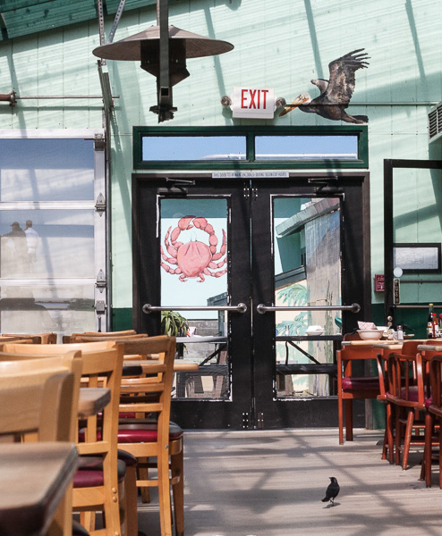
[Patio at the legendary Phil’s Fish Market in Moss Landing. We happened to get there at 10 am and it was empty. Had an awesome grilled salmon sandwich.]
Backing up a little, yesterday, after I took them all the serial commas out, some of the more complicated lists became hard to read, so then I put serial commas for some of them. Like “The myoor was shaking, the plants were warbling, and the unborn gubs were cheeping from within the myoor’s flesh.”
It’s considered okay to do that, that is, to generally not use serial commas, but to put them in when it seems really necessary. Not that the readers generally notice either way.
But then, this afternoon, dammit, (and goaded somewhat by my correspondent Mark Dery) I decided I did want my serial commas back, all of them, and I put them back in. Fortunately I had a backup version of my original MS and I could find the serial commas by searching for “, and” — I mean that turns up other commas too, but it does show you all the serial ones.
What writers think about…

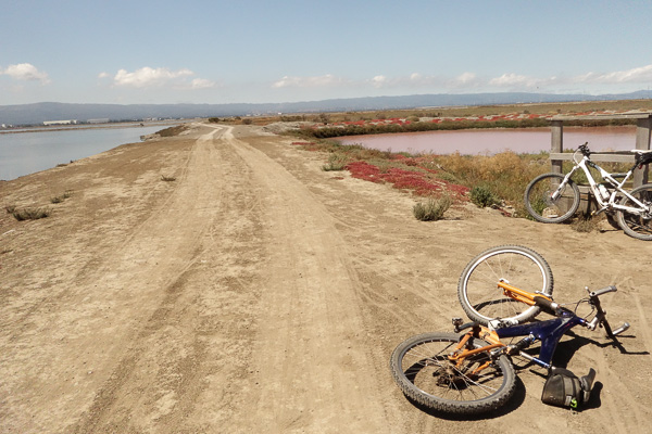
This photo was taken during a ride along the edge of the percolation salt ponds in the SF Bay near the San Jose Airport. Up at the north end of 1st Street in Alviso above San Jose. I was riding there with my 79-year-old friend Gunnar, who’s generally fitter than I am. The water drains back and forth between the ponds with the tides and you get cool vortices.
Anyway, this week I’ve been working on the book design for The Big Aha. Picking a font is a process that I’m still getting used to. I didn’t want to use the ubiquitous Times Roman—it’s nice, but I want the book to look not quite so generic. I used Garamond on Turing & Burroughs, and I was pretty happy with that until my cantankerous book dealer friend Gregory Gibson said, “Garamond looks…squatty.” That is, the vertical strokes, like in a t or an m, are shorter than in some other fonts, and the thick parts, like in the diagonal of an s, are a little fatter than normal.
Here in realtime, they’re tearing down a nearby neighbor’s house. It sold, and the new owners want more of a mansion on the big lot. It’s kind of sad and wistful to see an old house being shattered. And how easily they’re destroyed! Mortality.

Back to the fonts. My friend Michael Blumlein recently published his story collection, What the Doctor Ordered, with Centipede Press. The publisher is labeling it Horror, but I’d put it closer to Literary Fantasy. I wrote an intro for the collection. It’s a really nice-looking book, and I thought the font was cool, so I asked the publisher what he’d used, and he said Electra.
Now, Electra isn’t one of the more common fonts that you’d find already living on your computer, so I went and bought it online from Linotype.com, it’s like $30 for the regular letters and $30 for the italics, and more if you want the bold faces, or even the “display” versions that look good when blown up to huge sizes for signs. It’s conceptually interesting to buy a font.
After setting The Big Aha book in Electra, I decided I didn’t like the look of it. A little too spidery, with the letter elements overly thin, so that, at least to my eye, the letters felt a little gray or even broken. Maybe Centipede Press used a different version of Electra, I don’t know…but their book does look great.
Anyway, just to be safe, I went to a classic font that I could find on my computer, Caslon, that is, the Adobe Caslon Pro font. I like this one a lot. For me the idea of a font is that it should feel comfortable and be totally easy to read.

I was at a little BoingBoing-organized conference in San Francisco a few weeks ago. Longtime SF character John Law was there with samples from his Doggie Diner collection. John was an early activist in the Billboard Liberation Front—tweaking public signs in meaningful ways.
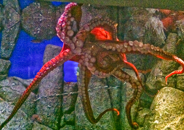
Saw an awesome octopus at the Monterey Bay Aquarium this week. His mouth isn’t open, but it’s the pinhole sphincter opening at the center of the star of tentacles, where they all meet, not that you can make that out in this dim-light iPhone shot. Inside the mouth lurks the dreaded cephalopod beak! I think about those beaks all the time. The ultimate vagina dentata. The octopus’s “head” is a big watery sac, used for breathing and for siphon squirts.
The actual “body” isn’t much bigger than a rabbit, it’s a lump on top of the tentacles, and its hidden in the false head sac. For sex, the male passes the female a spermatophore or “nuptial gift,” a packet of sperm, and she opens it days or weeks later, when she’s ready to lay eggs, in a spot that’s safe and with plenty of food. After the eggs hatch, the mother dies.
Love, love, love the tentacles. So serif. Which leads back to…
A little more talk about fonts. I can’t believe that people ever set a book in a sans-serif font. The serifs—those little blobs and curlicues at the corners of the letters—are such a help to the reader. Like handholds on a rock wall. Two more font bugaboos: using a really small font, and using gray letters instead of black or, even worse, white letters on a gray background. I think sometimes people use small fonts to save paper and cut production costs? Are you kidding me? Like giving a TV dinner to someone in a restaurant. Or a miniscule photo of a sandwich.
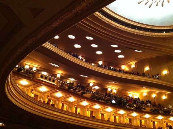
Dig these sweeping architectural lines at the San Francisco Opera. Love this place. Sylvia and I saw Mefistofele there this week. Not the greatest musical score, but a wonderful production, completely over the top. By no means what you’d call “sans-serif.”
Getting back to my rant about font design—one bad thing that that can happen is, I think, that a book or (more often) a web page might be designed by someone who doesn’t actually read.. They want to be different and cool and hardcore and they don’t actually like text. So—they go with 9 point Arial beige type on a brown background.
When doing a web page, such a person might compound their affront by putting in hard line breaks so the text doesn’t flow into new box-shapes, and they fail to use a screen-size-limited page width, so if you try and enlarge the web page by zooming the view, the text block grows right off the edge of the screen and you have to scroll back and forth like chicken pecking up cracked corn…but you don’t peck for long before you give up on reading the story. And the text-hating designer wins. But, hey, who reads, right?

Recently Sylvia and I found this amazing huge Richard Serra sculpture behind the Cantor Museum at Stanford. It’s like walking around inside a huge typographic letter, say an S or an 8. Before I experienced them in person, I used to think Serra’s sculptures were dull. Like sans-serif fonts. But when you’re inside one of them, it’s a whole experience. Emotional. Fear, awe, joy, mathematical exaltation.
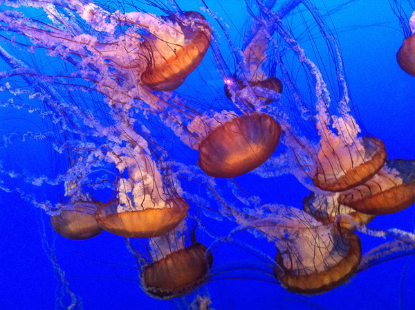
I saw some jellyfish at Monterey too. Sea nettles. Love these guys. Being there reminded me of visiting that aquarium with Bruce Sterling years ago, and we wrote our epic tale, “Big Jelly.” You can read it free online. Readable design…
September 19th, 2013 at 8:44 am
generally I agree with your font choice. Sans-serif doesn’t really do it for me either. However, most of the research on reading disorders related to dyslexia say that the sans-serif fonts help these guys stay glued to their place on the page. It makes me sad. I mean, for everyone else the little tails and feet help shape the word and make it whole. But then, we can read either one. For online stuff and electronic editions all that is easy. There just has to be an alternate style available. I guess the trick is to make it a well designed serif layout so the beauty of the page isn’t completely lost when “accessibility” options kick in.
something to consider, anyway
Best,
Rick
September 19th, 2013 at 3:52 pm
Rick, I hadn’t known that dyslexics are said to prefer sans-serif fonts. The nice thing about reading an ebook online or on a Kindle is that you can usually choose the screen font and its size. (The size issue is the accessiblity factor for me. I won’t buy a print book with a really small font.) Since the electronic recourse exists, I wouldn’t contemplate setting my print books in sans-serif, though. Hard to imagine that dyslexics are a big part of my book-buying audience in any case!
September 20th, 2013 at 1:12 pm
Thanks Rudy for owning up to inconsistency in the use of serial commas. I suffer from the same affliction. As in your commentary on fonts, sometimes the serial comma just does not look right. There are times and places where serifs look right and some times they don’t. Generally, as you’ve said above, I prefer serifs.
But wasn’t it Emerson or Thoreau who said that “a foolish consistency is the hobgoblin of small minds”?
September 23rd, 2013 at 2:00 pm
I was inordinately pleased to find that the serial comma prevailed 🙂
As for fonts, the less noticeable the better.
I can’t help but remember the dawn of the web when everything was a strange text color in front of a strangely-colored tiled pattern. It seemed pretty cool at the time, either due to novelty or my youth…
September 24th, 2013 at 6:58 pm
Rudy, I agree 100% with your comments about web sites being designed by people that don’t read. Maybe they do but are just so full of them selves that they have to do the “cool” thing. There is a streak of false-hipness in American culture that basically says “however everyone else is doing it is passe; do the opposite to show you are hip” or something to that effect.
For the record, I’m a good bit dyslexic and greatly prefer serif fonts.